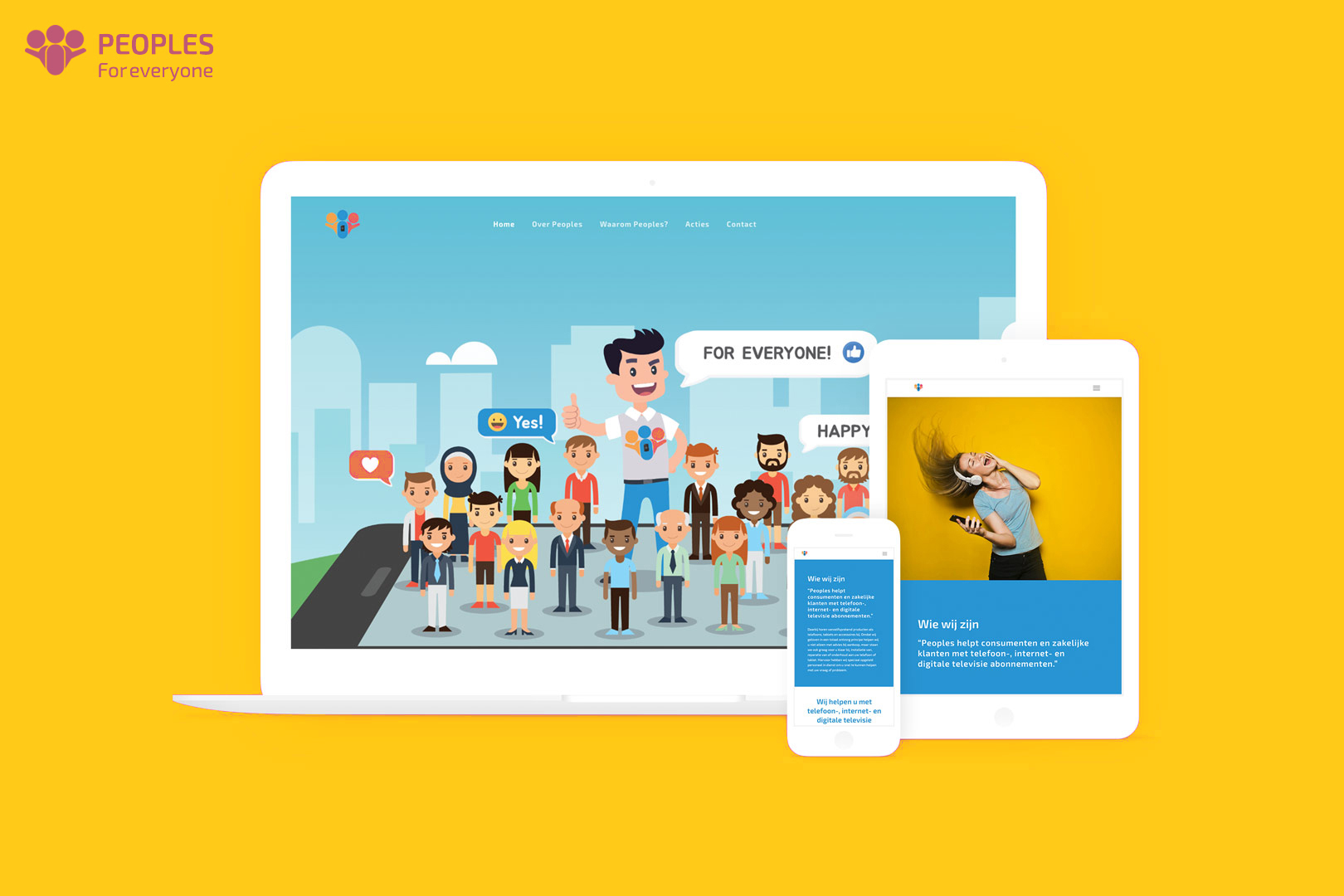
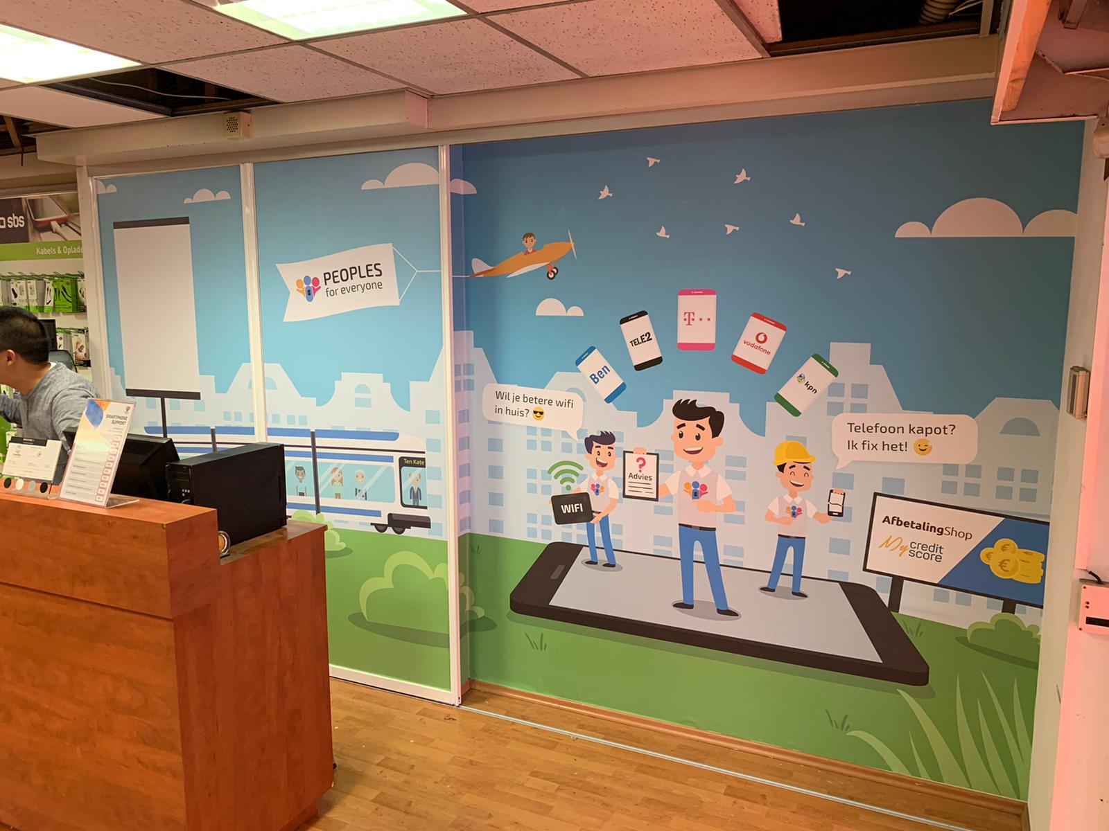
For this project Peoples Telecom asked us to give their new franchise a whole new make-over. They wanted te be recognisable and notable. Also a fun brand where people feel at home.
It was important for us to visualise what ‘Peoples’ actually means. After brainstorming it was clear that we needed to design a look where people came together at one place.
Focus Points
- Happy
- Colourful
- Diversity
- Ready to help
Design Style
- Bright colours (Logo)
- Flat design
- Character/mascotte designs


Project Outcome.
The Result
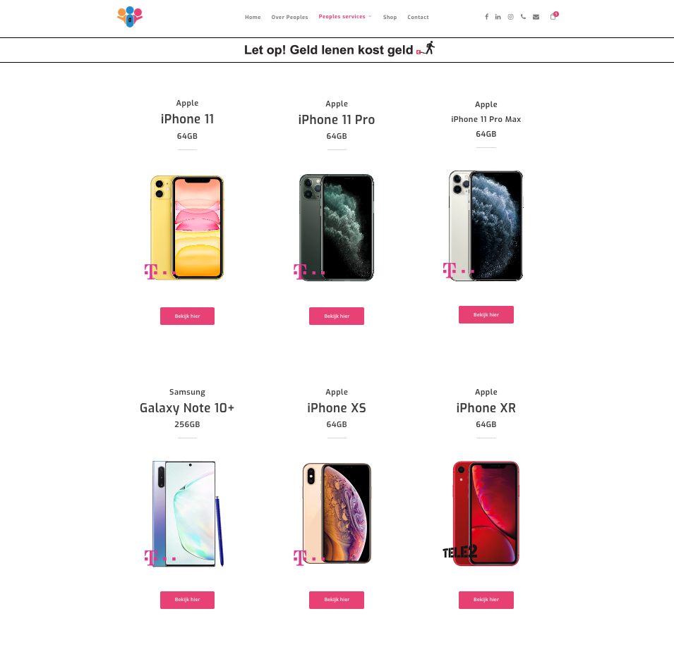
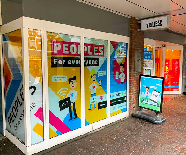
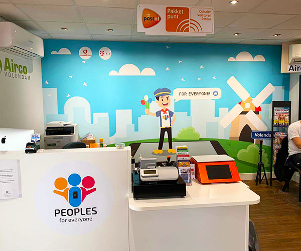
We gave Peoples a new look by adding people from different cultures together in their brand. Together with some bright colors, smiles and happiness we managed to apply this look on their digital platforms and in their stores.
For Everyone
Peoples has a new mascotte who is always ready to help anyone. Service is what differentiate them between other telecom brands. So it was very important to highlight that.